“I can love him” doesn’t have the same meaning as “I can’t not love him”. Double negatives aren’t necessarily improper.

One of my favorite video game theories to emerge over the past few years is that Super Mario Bros. 3, with its…
Ok, legit complaint I have with this review and even many of your other recent anime reviews Richard(but mainly this one in particular), this is less a review and more of a giant summary of the entire show. :|
When are you going to get back to actually reviewing things, as in doing full on critiques, rather than these…
Thanks for the post~! I’m very fortunate to have won this as I’ve been into Pokemon off and on since the late 90s. It was quite a challenge to draw on the 3DS, hah. Right now I’m trying to figure out my plans with the cards. If I ever distribute any publicly, I will most likely announce it via my artist page on FB.…
He’s been winning Smash 4 tournaments before the game was even finished.
Sometimes when I inject them with chloroform they don’t even realize they’re sleeping. - Mark Rubio
He doesn’t have to make something like Metal Gear anymore

It starts slow, and feels a little self-indulgent. But this Metal Gear Solid V debriefing ends with something of a…
I starred for the comment. I starred for the font comment. Then I panicked, because my star was removed.
what the hell happened to old font? This font makes my monitor set in 640x480 res.
It’s terrible. At first I thought I had accidentally increased the font size and was like “Why won’t it get smaller again!”

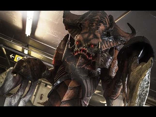
One of the most impressive cosplays at this year’s Otakuthon in Montréal, Canada was Starcraft-related. But this…
Agreed, It’s larger in scale, yet thinner too, so it’s less readable. For example, the flat line in the capital letter ‘A’ is faintly there, it looks more like an upside down V.
How do you all feel about the new font? It’s hard for me to follow.
TOLD STATUS:


