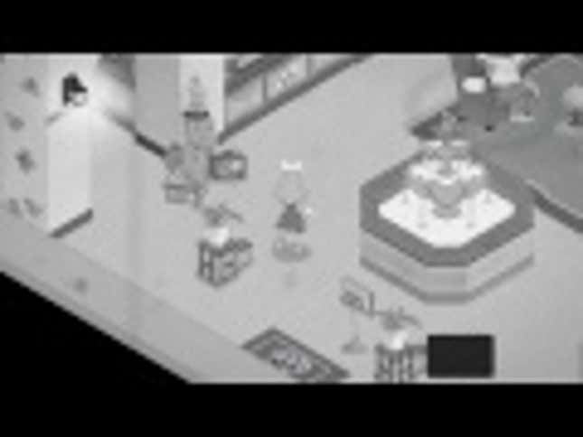
The animations aren't final and will be improved, according to the dev.

Keep up the great work and don't mind the haters: I don't think most of them realize this comes from an alpha build. Really looking forward to picking your game up.
Her super skinny arms and leg's, yet oover sized hands and feet do fit the bill for a 30's cartoon though.
I don't know if you're right or not. But Cherry looks much nicer than any of the ladies in the photo's you posted. So + 1 to the dev's from me. :)
I hope your game and studio do quite well and keep up the good work! Cheers! :-)
Same here, but maybe it's one of those things where all those early childhood memories seem to be involved and some people have taken it personally for whatever reason? A surprising amount of negative posts for what looks to be a fairly innocuous game though.
I honestly don't know what doesn't seem close enough to the style with the critics. Looks more than close enough to me ...
It looks like a neat game with an interesting take on on visual style. What I didn't expect was the large amount of dog piling from a few people who act like this burned some unknown rule book of old animation style. It's a modern game done by an indie studio with a limited budget and I think it definitely hit some…
I never accused you of saying the art was bad. The fact is the game isn't a piece of animation from the 30s, it pays homage to it. Besides, which part of it does not look like the classic cartoons? The drawing is simplistic, heavily stylized, and colorless. What else should he do other that copy another artist's work…
Between this and Cuphead, this is looking to be a banner year for us gamers who are also fans of vintage animation.
The perception of beauty has changed. Just because it pays homage to classic animation doesn't mean they have to copy its every detail. Besides, every artist has their own style. In fact, none of the animations from your three pictures look remotely similar.
NOW THIS IS RETRO! I am definitely supporting this!!!
Finally, something fresh in the world of retro visuals. :D
"Fleish and Cherry". Puntastic. Love it.
Mickey Mania on the Super Nintendo did something similar for the first level. This seems pretty cool too.
I remember backing this on IndieGoGo when they had their campaign some time ago. Too bad it failed, I hope they get the funds to finish it soon, game looks great.
I am in love with Cherry's design.

Fleish and Cherry is an-development isometric adventure game that looks like vintage black and white animation, with…


