Andrew— Just getting around to reading this now, but this is an outstanding and very comprehensive writeup in classic Jalopnik fashion. Great job and thank you.

Yeah but they made it look worse.
Haha, hard to argue with that. Though I will say, maybe it’s the blacked out trim or clipped lower front fascia, but like the AT4 Yukon, I think Z71 Tahoe is the best looking Tahoe (that’s not a high bar to clear).

I can’t help but think this is a step backward styling-wise. The AT4 trim actually looks decent, but that Denali is uggo compared to the current one if you ask me. I hate the headlights, I don’t like the grille, and I really don’t like how the GMC badge appears to now be a rectangular piece of plastic or how it’s…
So is this still real Quattro (the full time, rear-biased system) or are they switching to the new “ultra Quattro” that disconnects the rear driveshaft and basically operates as FWD most of the time?
That actually looks pretty good. I mean, it looks more like an LR4 than a Defender, and I would have liked something more retro and closer to the original (like Mercedes did with the G-wagon), but that’s a different argument. For what it is, it’s not at all bad looking. Just not quite a Defender.
Counterpoint: all of those cars looked ridiculous and I’m never ever going to buy something that looks like a freaking insect or egg or dorky glorified golf cart. Whereas this actually looks GOOD and is more reminiscent of the stuff Honda used to build and sell here in the early-mid ‘90s.

Anybody else feel like the front end styling on this thing is a downgrade compared to the current model? The headlight design is unimaginative at best, I don’t like the way they’re positioned relative to the grille, and the angle of the front end makes it look like it has a massively swollen lower jaw.
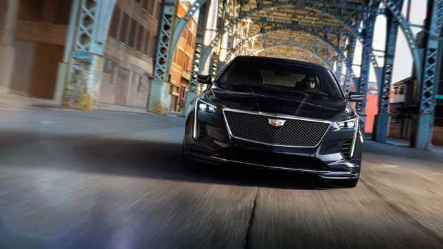
The funny thing is, the CT6 actually outsold (9,669 units) the 7-Series (8,271), as well as the G80 (7,446) and G90 (2,136) combined in the US last year. It also outsold the Lincoln Continental (8,758).

Still a tragedy that the CT6 is to be killed off so soon, after a relatively short existence, and just as it was getting really good with the V8 and CT6-V. This car was such a monumental leap forward for Cadillac, from the new lightweight platform to the SuperCruise debut, not to mention the fact that it was the first…
That actually looks pretty good. Interior looks great too.
Cadillac should have just given us the Escala.
First Gear: that might be the first intelligent thing I’ve heard out of Hackett since he took the helm at Ford.


