

She never told him his comments were making him uncomfortable and he wasn’t doing anything too inflammatory to begin with. This is a non-issue.

board1288
board1288
They are, but it’s going to come out later and will be smaller from what I hear. They’re demolishing a whole soundstage for the Hollywood version.
I really enjoy my Skyrim Collector’s Edition (even if it was the PS3 version *shudder*). I still have the Alduin “statue” proudly displayed on one of my shelves. Then again, I didn’t pay for it because it was a christmas gift, so I can’t really get buyer’s remorse from it. And yes, Alduin’s spikes make it hard to…
If I were to guess, I’d imagine the animation would look similar to Dragon Quest: Your Story - decently good movement, but very deliberate looking and not quite as polished as a Pixar movie (understandably so).
If this game isn’t a full $60, I’m totally on board. I loved the space combat of Battlefront 2, so this is right up my alley.
If only Gearbox could sell or work out a deal to return the rights back to 3D Realms. I think 3D Realms’ recent management has proven they can do wonders for the franchise. However, I’m sure our old pal Randy Pitchford wouldn’t let that happen.
And you people wonder why most don’t consider you real journalists.

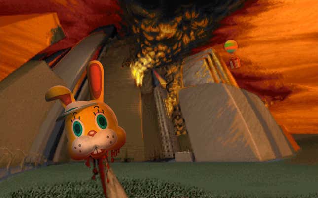
That grey arch near the top of it is supposedly the entrance to the Donkey Kong area, so it’ll probably be a fair bit bigger than the above picture...maybe?
I agree. 720p is more than enough to experience these games as best as they’re gonna look. I assume it’s to allow for re-texturing mods to shine, but those usually look bad as well.
I feel the exact same. I had both a PS2 and Gamecube growing up, but I never played skating games because I had no interest in them. Now I’m realizing how much of following these games really had.
As someone who’s been to an Akihabara arcade, sure the sounds are cool, but it reeks of cigarettes in there.
Woah, this is a surprise. Congrats to the other nominees!
Somewhat unrelated, but the page you posted encapsulates what I dislike about Ghost in the Shell’s source material. It’s so needlessly wordy that it felt like a chore to read. I basically forced myself to finish it for the sake of finishing it.
Looks like USB-C to me. I doubt they’d keep Micro-USB
I don’t own New Horizons, so I don’t really know how annoying this guy is, but here ya go.
Yours reminds me of when I watch movie credits in a dark theater. As soon as the credits stop moving, it looks like the whole world is moving downwards for about a minute. I guess my brain is doing the same “counter-balance” thing that happened with you.
Set the font size the LARGE then. It’s in the settings. I agree that tiny font is a problem in most games, but cherry picking and leaving out information to prove a point in your article is kinda lame.
There is a dedicated FONT SIZE option in the game, something that this article neglects to say.
It’s animated to simulate an overexposed camera, which makes skin tones seem lighter.
It’s animated to simulate an overexposed camera. It’s not whitewashing. Kotaku’s on their bullshit again.