potions
Potions
potions

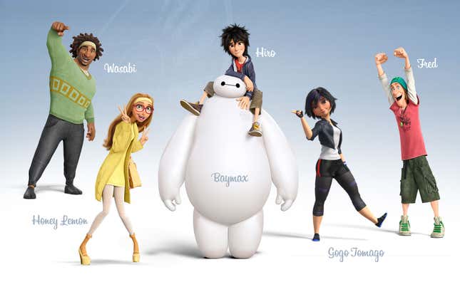
Ya that’s the real issue with this, it’s not “Cartoony” it’s “Disney style” Cartoony is ones own unique style of drawing people or objects/things this isn’t really a personal style it’s heavily influenced from disney and not a “cartoon”. While the coloring and design are decent it looks like something out of Big Hero

The problem is the face. I don’t know who that is.

Aye! Stop feeding art institute graduates who think that Disney crossovers (or the Disneyfication of pre-existing characters) are creative. Technical skills alone do not make quality art - quality art requires at least some innovative, personalized touch (among other things), and that simply isn’t present here.

This design is AWFUL. I can’t even.

The funny thing is that this design is just as out of proportion as the original design. All they did was trade massive breasts for massive hips.

I HATE the design. It’s different and cutesy for the sake of being different and cutesy. Same as when they recreate non-human objects as human. They just draw a freakin’ anime character with a few remnants of the original object. That said, I LOVE the talent needed to create the images. Definitely talent that needs to

I hate these so much...