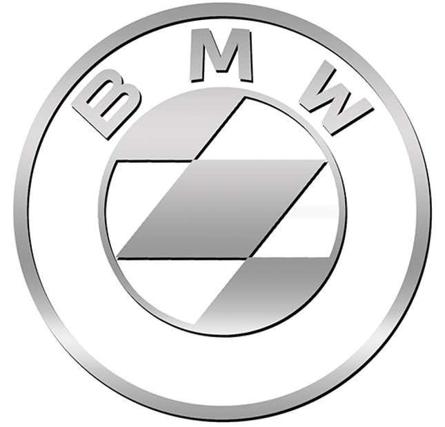
Counterpoint: It’s fine. Your ‘improved’ version just looks like a generic, meaningless symbol or emoji. I far prefer the lettering with it. I feel like focusing on the ‘propeller’ (yeah, I know that’s not it) is the opposite of what should’ve been done. They’re transitioning into new territory, and doing new things.…


