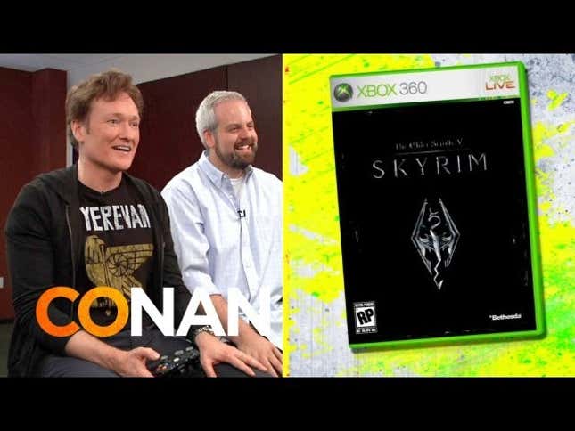
I personally prefer Conan’s rating systems on `Clueless Gamer`. I think you guys should adopt that.


I personally prefer Conan’s rating systems on `Clueless Gamer`. I think you guys should adopt that.
My big question: why is the review box an image? The layout and styling of it could more than easily be accomplished with simple HTML/CSS, and the advantages are numerous:
My guess for the “thumbnail” tag is that its for courses whose blocks/objects are arranged in way to create a picture of something. *shrug*
Yep, the way I would envision it is that just like how you can use the slider to increase/decrease the width of the stage, you’d have the same thing on the vertical axis. But increasing the vertical height would decrease the max allowable width, so that essentially you were given a flexible rectangle, to decide if you…
Sounds great! Really hope they keep it up with these updates adding new mechanics and items, definitely will help to keep the game fresh.
Question for PS4 owners:
If you thought Michael Shannon was good in Superman, you should see The Iceman if you haven’t already, excellent movie.
Battlefront looks impressive at 19x12 in any case.
I think WoW will be around in some shape or form for a long time to come, especially since it looks like Blizz has no interest in making a true successor MMO, and rather has shifted to focusing on smaller games like Hearthstone, HotS, and Overwatch.
Rogues will gather beneath Dalaran in the Underbelly sewers
I wonder if her name is a tribute to the “Trashcan Man” from Stephen King’s novel, The Stand, which also takes place in a post-apocalyptic setting.
uphill both ways!
Or, you know, Bethesda just might’ve gotten a little lazy (underestandly so, with the size of these worlds they create), and just re-used some of the assets from Skyrim..
Agreed.
I think you can have a really slick, svelte UI that is super intuitive without losing the immersive-ness and aesthetic of an in-game object based UI like the pip-boy though. For example, Dead Space comes to mind as an excellent UI that is completely in the game world, and not just some abstract menus/windows like an…
I think thats kinda the whole point of the article. A good UI should be able to intuitively convey meaning to the user through its design and the text/symbols it uses, w/o the person having to guess or look it up in a manual. And it doesn’t seem like Fallout’s UI does a good job of that.
Its more just that 99% of the streams and blog posts about Mario Maker show only the insanely difficult stages, because they are more fun to watch, and well I guess people love schadenfreude. :-P
How do I fight the impulse to take EVERYthing with me, just in case? That’s what RPGs have trained me to do, after all: hoard, hoard, hoard.
Hey...its not a moba.